The Better the Data, the Bigger the Following
Overview:
The UMN Press Twitter Widget offers marketers a way to find their user content and repost it to their Twitter following; however, it does not show their work's impact on their following. Adding an analytics page to their widget allows the team to quickly and effectively see the impact of posted content and gain a better understanding of their followers.
Role: Research Planning, Data Analyst, Low/High Fidelity Designer, Digital Wireframe Execution & Creation of Prototype Tour 2020
Tools & Methods: Cognitive Walkthrough & Contextual Inquiry, Primary User Research Protocol Script, Journey Mapping & Wireframing, Invision Prototype, Sketch, Invision, Zoom, Otter, QuickTime Player, Craft
The Process
By conducting a cognitive walkthrough and contextual inquiry sessions, our team quickly understood the UMN Press Twitter widget value. The amount of work being done on the widget clearly impacts the UMN Press's Twitter following. Prototyping an analytics page gives the team a way to gain valuable insights and set business goals.
Continue reading to learn more about the decisions made for this project.
Understanding the current system
Methodology: Cognitive Walkthrough
Graciously the UMN Press marketing manager sent our team a video demonstration using the Twitter widget. The video sheds light on how the platform functions and how the user navigates their work.
Tasks Observed:
Pulling a new batch of tweets into the platform
User navigation such as searching for tweets to approve, or reject, like, or narrow down a search topic by author & title
The video also showed areas of widget that could be improved and further needs to discover user insights.
The infinity Diagram above contains the questions and observations our team noted from our cognitive walkthrough. This guided us to write our Primary user research protocol script for our contextual inquiry.
Areas for IMPROVEMENT
METHODOLOGY: COGNITIVE WALKTHROUGH & Protocol Scripting FOR CONTEXTUAL INQUIRY
Although the user could accomplish a majority of tasks, the research team noted a lack of mental model structure, the need for feedback, and visibility deficiencies. Meaning, compared to other platforms the user is accustomed to, like Google Analytics, the system shows an absence of familiar features such as easy searchability, absence of confirmation feedback after clicking on a given target, and overall difficulty navigating the widget.
PROTOCOL SCRIPTING FOR CONTEXTUAL INQUIRY:
After reviewing the pros and cons of the contextual walkthrough, our team developed a script for conducting a contextual inquiry with our user. The scripts goal were to:
Better understand the work process and goals of each day
Uncover the degree to which this Twitter widget could make workflow easier and what its correlation is to performing meaningful work
Better understand the extent to which her physical and non-physical environment impacts her workflow

“As a user, I should never have to devote a millisecond of thought to whether things are clickable-or not.”
— Steven Krug, Author of Don’t Make Me Think
Research Findings & Prototype Plan
During our contextual inquiry, the user stated the importance of using analytic tools like Google analytics and overall goals of reporting on trending topics and books. For example, the user can show evidence to their team based on analytic data and social media postings that a particular book should be reprinted.
Therefore the decision to create an analytic page showing liked tweets, trending topics, trending hashtags, insights from the widget, and metrics from approved or rejected tweets would be critical for helping improve overall work duties.
Prototype Benefits & Decision Insight:
Twitter is home to the UMN Press's largest following, therefore being able to pull trending data on their followers is vital to their team's goals
As noted as an area of need, the prototype includes areas of confirmation and feedback design to build user confidence that the system is working as it should.
The prototype includes familiar mental model features like graphs, exporting and date range options, word cloud areas, clear icons to help with recognition over recall, and a refresh data button
The center column shows data directly from the widget, whereas the column labeled Approvals, Approval Trends, Top 3 Tweets, Top 3 Influencers, Your Follower’s Trends, and @UMNPress show data directly from Twitter
Overall design elements reflect the current design of the platform and incorporate key design elements such as color palette, text treatment, and icons, this brings a sense of familiarity when using the page and keeps in line with the developer’s guidelines
Continue reading to discover more about each section of the analytics page OR click the button below to get a full demo of the prototype!
Analytics Sections Defined
WIDGET METRICS
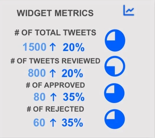
This section specifically highlights data directly from work being done on the widget. Comparing the number of tweets being pulled in to the widget versus how many tweets get reviewed, rejected, and approved can help when asking for more staff resources or building upon future goals. Notice the blue graph icon in the upper left-hand corner giving feedback to the user that the graph option is active.
# Of Total Tweets: Here is the total number of tweets the widget has pulled into the system
# of Tweets Review: this shows the total number of tweets that have been reviewed using the widget
# Of Approved: Of the reviewed tweets, only 80, or 10% have been approved
# of Rejected Tweets: Of the reviewed tweets 60 or 8% have been rejected
APPROVals
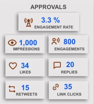
This area shows the impact of your approved tweets. This type of data is key when considering all the different touchpoints your approved tweets can have on your following.
Impressions: Times a user is served a Tweet in timeline or search results
Engagements: Total number of times a user interacted with a Tweet.
Engagement Rate: Number of engagements divided by impressions, therefore; showing activity levels of your audience
Likes: The number of times your approved tweets have been liked
Replies: Total number of times a user replied to approved tweets
Retweets: Shows how many times users have retweeted approved tweets you have posted
Link Click: How many times your users have clicked on a link you have included in a post
Ways to Help Improve Content
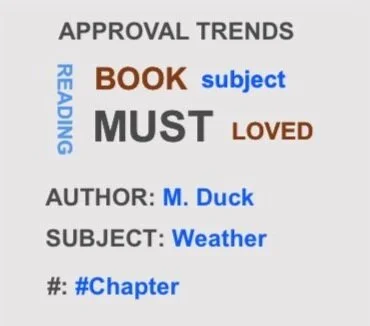
This section shows the most commonly used words depicted in a word cloud, along with the most popular author, subject, and hashtag used in approved tweets.
Test New Content
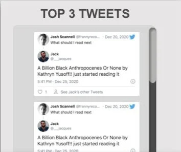
Here is where you can find the three most popular tweets you have approved. This information can be key when trying out new content compared to previous postings.
Keeping an Eye on INFLUENCERS
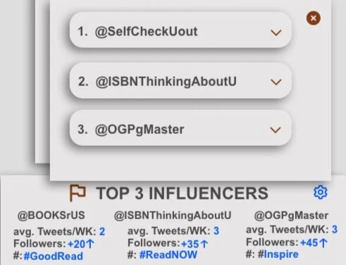
Knowing how many times your top 3 influencers tweet per week and the rate at which they are growing will help set benchmarking goals.
What are Your Followers saying?
This area gives you a clear idea of your follower’s trends. This is key to understanding if you are keeping up with your followers’ interests along with how the tweets your approval from the widget compares to your follower’s trends.
Are You Growing in followers?
This graph gives a quick gut check on how much you're growing or losing in followers over a set timeframe.
YTD OR YOY REPORT? YOU DECIDE!
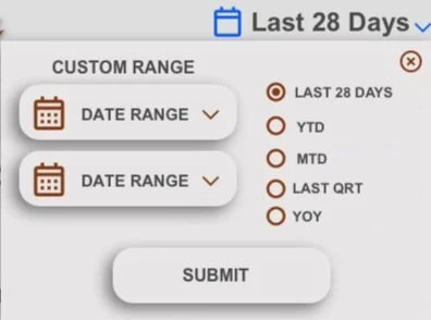
An easy to use calendar drop-down allows you to be in the control seat when it comes to pulling date ranges. Also notice how the radio buttons, icons, and submit buttons give the user feedback confirming their intended actions.
PROJECT OVERVIEW NOTES:
This project was made with love from a former marketing manager turned Ux Designer. This was such a fun project to work on because, as a former marketing manager and now a UX Designer, I know how vital this data is for goal setting, budgeting, and planning. The choices made for this project were very deliberate to provide a tool for the UMN Press team to leverage to use the widget more effectively and to better understand their followers.


